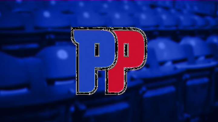
The Detroit Pistons released their new logo last week, on the same day as the draft lottery. Unfortunately it didn’t bring with it the required luck to get the the number one pick as they stayed put at number 12.
The Detroit Pistons were overdue for a logo change as the old one was very simple and basic. That’s fine when its referencing historical logos or drawing inspiration from them, but this one wasn’t.
My first impression when I saw the new logo was “this looks familiar, I swear I’ve seen this before”. And for those of you thinking the same thing… it turns out we were right! Or nearly so. The Detroit Pistons have taken inspiration for this logo from their most successful and discussed era, the era affectionately referred to as the Bad Boys era. This is a change that couldn’t have come soon enough. The modification is timed to coincide with the Pistons move back to downtown Detroit.
Detroit Pistons unveil new logo with an old twist https://t.co/zcMq6tg962 pic.twitter.com/jDEhKK9qw0
— Local 4 WDIV Detroit (@Local4News) May 16, 2017
They got the color scheme spot on. The blue and red is classic Detroit Pistons, and by adding the chrome outline that references the history of Detroit’s car manufacturing, it also suggests that the chrome uniform is going to stay, which is good as it looks spectacular. The logo also retains the font worn by the players on the floor.
Related Story: SVG talks about the Pistons return to 97.1 and more
In my opinion it is a good change, a solid design, and the reference to the Bad Boys will win a lot of people over very quickly. But it’s also a very safe option. This was the chance to get really creative idea and create something really unique and memorable to create some buzz in downtown Detroit.
