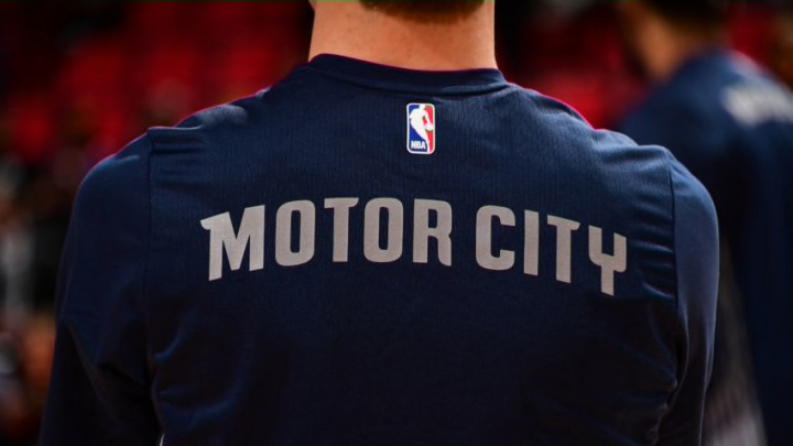
The Detroit Pistons unveiled their 2018-19 “City Edition” uniforms on Thursday morning. First implemented last season, all 30 teams will receive an updated version each year.
The Detroit Pistons unveiled their latest alternate jersey (sorry, “City Edition” jersey) on Thursday morning. They’ll be worn for 18 games, and will debut on Nov. 23 when the Pistons host the Houston Rockets, according to Rod Beard of The Detroit News.
First introduced in 2017-18, the “City Edition” uniform will change every year. The design is somewhat similar to last year’s version, which featured a dark, navy blue top with gray lettering.
However, the 2018-19 iteration is a bit more creative. Black replaces the navy blue. “Motor City” is once-again emblazoned across the chest (this time in chrome), with the player’s number directly underneath the arching script.
But the most noticeable difference (or elephant in the room) is the two parallel lines that run straight down the middle from the collar to the waistband.
FIRST LOOK: @DetroitPistons "Motor City" City Edition Uniforms pic.twitter.com/u4AtLtFVwM
— Darren Rovell (@darrenrovell) November 1, 2018
It’s…something, that’s for sure.
The two lines appear to be racing stripes, a possible nod to Detroit being the automotive capital of the world. Personally, they remind me of roadkill, but I highly doubt that was the intention.
The Pistons offered this brief description of the new uniform in a tweet (hyperlink can be found in the first sentence of this piece.)
"Our new black City Edition jerseys are based on inspiration from automotive culture and the hard-nosed mentality of Detroit."
Paying homage to the city’s industrial past and blue-collar attitude is always a good look. But I can’t help but think, with a name like “Pistons” (which dates back to their founding in Ft. Wayne, Indiana), the possibilities are endless.
To be fair, there’s more creativity in this year’s City Edition jersey than last year’s. And there are some subtle elements that look pretty sharp. Yet it still leaves me wanting more.
Oh well, there’s always next year!
You can see a side-by-side comparison of all four of the team’s uniforms on the Pistons’ website.
What do you think of the Detroit Pistons’ latest City Edition uniform? Let us know in the comment section below.
