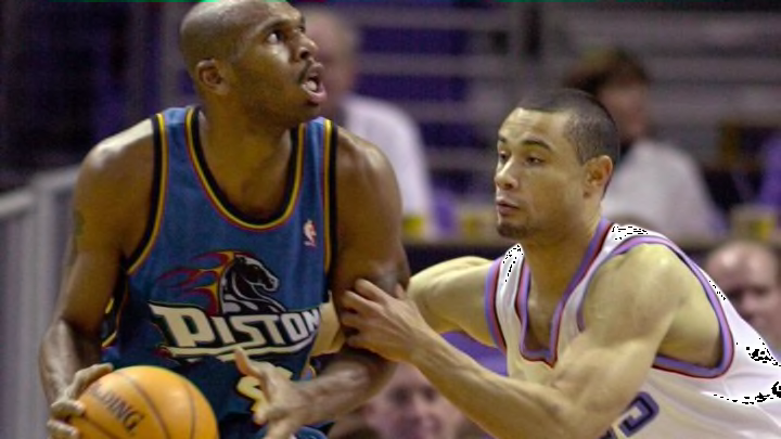
Piston Powered writer Eric Black is disinterested with the current Detroit Pistons jerseys and logo, but is willing to compromise under one condition.
The Detroit Pistons used to have a pretty cool logo and jerseys from 1996-01 and now they’re boring.
The Pistons infamously changed their logo and color scheme for the start of the 1996-97 season. The Bad Boy era was at an end, most everyone gone except for Joe Dumars, and the team did what a lot of teams did in the 90’s and adopted a much more cartoonish inspired style.
The new look jerseys featured teal, red, and orange. The logo was a flaming black horse head with exhaust pipes exuding flames. It was a wonderfully bizarre creation then, and one that stills garners a lot of criticism from older fans.
To be fair, what the ensuing era of Pistons basketball would become paled in comparison to the time that preceded it. The five-year period from 1986-91 had the Pistons at least in the Eastern Conference Finals each of those years, including three straight NBA Finals appearances and back-to-back championships.
While the excitement of the early years of Grant Hill seemed to indicate a promising future ahead, an ankle injury in 1999 during a playoff run followed by Hill’s exit to Orlando in 2000 free agency left a sour taste in everyone’s mouths.
It was after a season of bad basketball and Jerry Stackhouse shooting 24 shots per game that the Pistons made another change in the color scheme in 2001, going back to the red white and blue of the past thus ending the “teal” era but they still kept the horse logo.
In a move of cowardice in 2005 the Pistons once again changed their logo to … a basketball.
More from PistonPowered
- Which Detroit Pistons could save Team USA in the Olympics?
- Detroit Pistons could have major roster churn after 2023-24 season
- The best Detroit Pistons to wear each uniform number
- Full Detroit Pistons NBA 2K24 ratings
- Detroit Pistons: Who will sign the remaining NBA free agents?
To me, it’s not about history or nostalgia, it’s about looks. There’s nothing cool about your logo being a basketball. Honestly, why are they even called the Pistons if there’s going to be no tie-in with the visual marketing? Although, the one survivor of the “teal” era is the mascot Hooper (officially born in 1996) which is something, but Hooper doesn’t impact at all what the jerseys look like.
Last year’s city jersey was a black jersey with chrome around the outside. Yawn.
The Pistons uniforms have gotten tremendously boring in the recent past, their “statement” grey uniforms being the worst of them. At least the city jerseys are trying to be somewhat different, the grey’s are just uninspired. Red, white and blue is also an indistinguishable color scheme, three other NBA teams have those as their primary colors.
For those that don’t like the teal look with the weird horse with flames on it, I get it. My goal here isn’t to convince people that you should like it. But what I am saying is that the status quo isn’t cutting it either.
I’m willing to compromise on only one condition.
I’ll concede the primary colors to red white and blue, but the weird horse is coming back.
Stay up to date with the latest Pistons news and analysis by liking Piston Powered on Facebook and following us on Twitter @PistonPowered.
