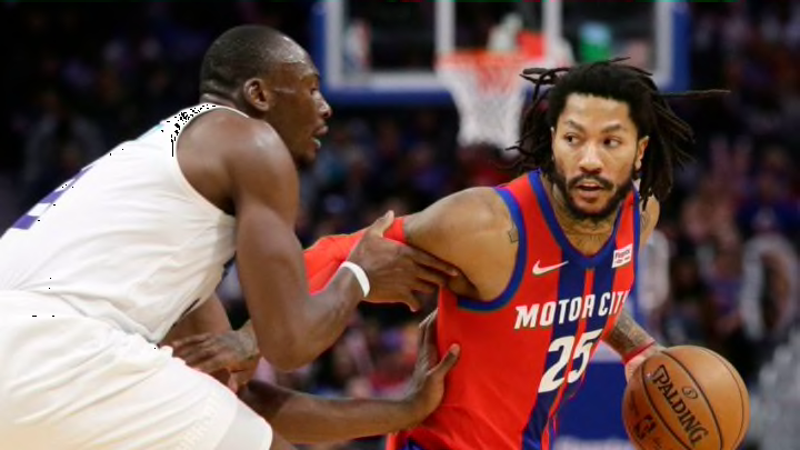
The Detroit Pistons red city edition jerseys were unpopular from the start but are they really that bad? The Piston Powered team offers their thoughts.
When the Detroit Pistons city edition jerseys first leaked from a dark Champs store, accidentally released before the team could release it themselves, the Pistons came to the forefront of plenty of jokes.
But after the franchise released the jerseys with well-lit photos and debuting them on Friday night, a 110-107 loss to the Charlotte Hornets, it’s clear that the jerseys may not be as bad as some thought. That’s the case even if fans still don’t like them.
Many had the same thoughts I did, “This looks like a soccer jersey.” Not so much when the team is wearing them on the court with shorts.
The Pistons listened to the fans, who clamored for the return of the red alternates, a significant upgrade over the black “Motor City” jerseys. The red with blue striping pays homage to a Mustang, which the franchise used as part of their jersey release.
Our team chimed in on their thoughts of what the city edition jerseys look like.
Aaron Ferguson (@Sports_Aaron): At first, with a poorly-lit and shaded look at the jerseys, it didn’t look great. But the city edition jerseys have actually grown on me and, as a fan of Mustangs, I like the look now that I’ve seen them on the court with the shorts. Additionally, when the jerseys first came out, I thought it was fitting for Sekou Doumbouya, a native of France, and that those may become a top-selling jersey as a result.
Aaron Kellerstrass (@TheBukShow): The new uniforms are ok, would like the jersey stripes to be on the side but they are better. I wish they’d change the whole concept away from the car manufacturing angle and make it about Motown. Hitsville, USA jerseys based on the Motown museum are my hope.
Noah Stump (@noahStump): Personally, I like the jerseys. The video with the SRT painted exactly like the jerseys kind of played it well for all questioning the stripes down the center. We asked for a red to offset the horrible years of bland chrome and got some good color. I get the issue is the opportunity cost of the situation with all the things they could have done in terms of our past jerseys, but beyond and past that, the jerseys are nice and better than most others in the league that we’ve seen thus far.
More from PistonPowered
- Which Detroit Pistons could save Team USA in the Olympics?
- Detroit Pistons could have major roster churn after 2023-24 season
- The best Detroit Pistons to wear each uniform number
- Full Detroit Pistons NBA 2K24 ratings
- Detroit Pistons: Who will sign the remaining NBA free agents?
Steven Bryant (@steven_bryant1): As much as I’d like to enjoy the City Edition jerseys, I feel like they’re pretty lackadaisical. While the colors used are very vibrant and jump out, I look at the designs of other teams and am quite jealous. Obviously, the Denver Nuggets take the crown for best jerseys. Memphis is cool. But Detroit just seems like they took a jersey template from 2K20 and put red on Color 1 slot and put blue on the Color 2 slot. And added Stripe 14 to the jersey. I’m not saying I’m a design expert, but I was pretty underwhelmed. Probably a 5/10.
Joe Minyawi (@joeminyawi): I am not a huge fan of the jerseys. At first look I didn’t like it at all, it seemed like a knockoff jersey that would be sold abroad. Then it slowly is growing on me, however, I’m not sure I totally would buy one. I like the red base which is what we asked for, but the racing stripes just don’t mesh well to me.
Keith Alrick (@kramerica100): My initial reaction to the city jerseys was that someone made them in paint as a joke. But they’ve actually grown on me since and honestly anything is better than the black ones last year
Blake Stackpoole (@BlakeStackpoole): I think the jerseys are something totally different just like drafting Sekou, something different for once. Additionally, they looked a lot better on the floor and with the shorts.
What do you think of the Pistons city edition jerseys now that you’ve seen them?
